2022: Brace for Uncertainty & Volatility
Geopolitics and Inflation: Two stories driving the markets
In our last note about the markets near the end of the year, we focused on what we saw as the singular story driving the markets, Inflation. At the beginning of the second quarter of 2022, the story continues: inflation continues to drive headlines, political decision making and market movements, exacerbated by the conflict in Ukraine, and all eyes are on the Federal Reserve’s response plan.
Below, we’ll go in depth on these issues, starting with a discussion of inflation from a high level, getting into some charts and data, then we’ll talk Geopolitics (briefly). We’ve been monitoring the situation in Ukraine as it has evolved, and this post has been completely re-written multiple times over the course of the past few weeks, so please keep in mind the dates of various sources. Since these topics can be troubling, we’re going to put these discussions behind elements that require you to interact with them so that you can choose which content to engage with. As always, please don’t hesitate to reach out to us to discuss anything you see here.
We’re also excited to present a few new features from our sustainability reporting vendor, YourStake.org, where the team has built a new dataset to report on our portfolios’ exposure to Russian business involvement. We’re also excited to share the first version of our new dynamic reports, and invite you to scroll down and click on the impact reporting buttons to explore each portfolio in depth – you can now click through each metric to the underlying holdings in the investments and see how your investments are screened for Environmental, Social and Governance criteria. If you’d like us to customize these reports for your account and values, please feel free to click here to take our values questionnaire if you haven’t already – we’ll send you a report on your portfolio (which we may have customized based on your preferences) which reflects data points that YOU care about (and your actual investments, which may differ from the models).
Talking Inflation & Geopolitics
Let’s Talk Inflation (at a high level)
This is the single most important issue facing the markets at the moment. As the pandemic shifts to an endemic stage (see the section below on possible good news!), the economy is dealing with an extreme imbalance between the pent-up demand from the past few years, while still dealing with supply chain issues resulting from lockdowns, both the ones here in the US (which we do NOT expect to happen again) and the ones that are still ongoing in China. Add to this the fact that the unfair economics of being a truck driver are forcing people out of the profession (here’s a great video on this – it’s a complex issue), and the country has a perfect storm of pressures forcing up prices.
In the next section, we’ll go in MUCH more depth, but since this is the high level overview for those of you who might not want to get buried in charts, here’s a great explanation (with audio) that gives us some hope, of why historically, inflation has correlated pretty closely with increased corporate profits and higher stock prices.
All of this brings us to the critical discussion: Interest Rates. The Federal Reserve raised the fed funds rate from zero to 0.25% at its March meeting, which started to give the markets some clarity on the path of how the Fed will be raising interest rates at the same time it institutes “Quantitative Tightening”.
We think it is important to remember at this point that markets are forward looking, in that all market participants are making changes based on their expectations of what will happen, and then adjusting their strategies based on what actually happens. The Fed has clearly learned from past rounds of interest rate increases, and is playing the expectations game at a high level. More on this when we talk about Geopolitics later.
Investors with a long time horizon should remember that we’re in this for the long haul and stick to the plan we’ve made. Investors with a short time horizon should get in touch and review our strategies to make sure we’re still investing in line with your tolerance for risk. We expect a period of heightened volatility over the next few quarters as markets pick apart each statement from the Fed and move in reaction.
New inflation numbers are due out on Tuesday, 4/12/22, and we expect inflation to continue to run high.
Into the inflationary weeds (with charts)
At the highest level, inflation is a measure of how expensive things are, and is driven by the classic macroeconomic forces of supply and demand. The question we face now is simple on its’ face, but extremely difficult to answer: it’s obvious to anyone that prices are going up. Why are they going up and how long will this last?
First, let’s talk about just how much prices are moving, and the different components of inflation. This is one of the most complex charts we’ve put together for these posts, so some explanation is in order: the blue line below is the Consumer Price Index, which is a broad measure of inflation. The red line is a smoothed out version of the same measure, but with Food and Energy costs stripped out, and the green line is a measure of the change in price for “Durable Goods” – these are the big infrequent purchases we all make, things like furniture, cars and big appliances.
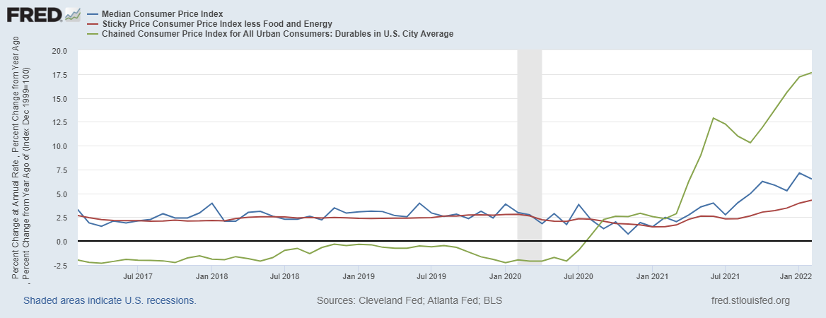
As you can see from the chart, Durable Goods and Energy prices account for the biggest portion of the recent bout of inflation (see the gap between the blue and red lines for the impact of food and energy). So what’s going on?
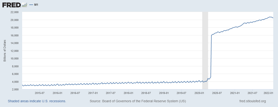
There are a number of data points to consider here. First, some charts that we’ve looked at every quarter since the pandemic started, which look at the way money is behaving (or rather, the way people’s relationship with money has changed and continues to change) due to the pandemic (yeah, we’re not going to avoid that topic here either).
First the M1 money supply, which measures ‘near term’ or ‘demand deposits’ that are easily accessible (hover your mouse over all of these images for a more technical description). Note that this was rising at a stable, low rate before the pandemic, but has continued to rise at an accelerated rate after the cash injection that occurred in 2020:
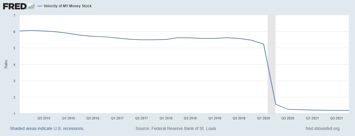
You can also see the same trend in reverse in the ‘Velocity of money’ which measures how rapidly money is flowing through the economy. This has gone off a cliff since the pandemic started, and critically, remains depressed.
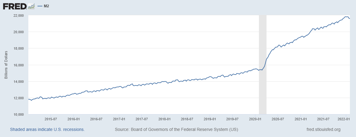
Likewise, the M2 money supply, which is a broader measure of cash in the economy which includes M1 and also CD’s, Money Market funds and the cash in Mutual funds, shows similar trends:
As does the Velocity of M2:
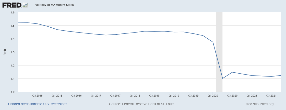
This tells us that there is still a huge amount of cash on the sidelines, AND that the balances in most peoples’ checking and savings accounts (at least, for higher earners, who we believe skew this data) continue to rise. That last link is a really interesting read, and we’ve been paying a LOT of attention to the differences between the Median balances in accounts and the Mean (here’s a refresher if you need to brush up on statistics) – To us, this is an indication that there is still pent-up demand in the economy. However, the fact that this cash is weighted towards the affluent, who spend a significantly lower percentage of their income on basic necessities. There is, quite frankly, an extreme level of uncertainty as to how long this situation will last.
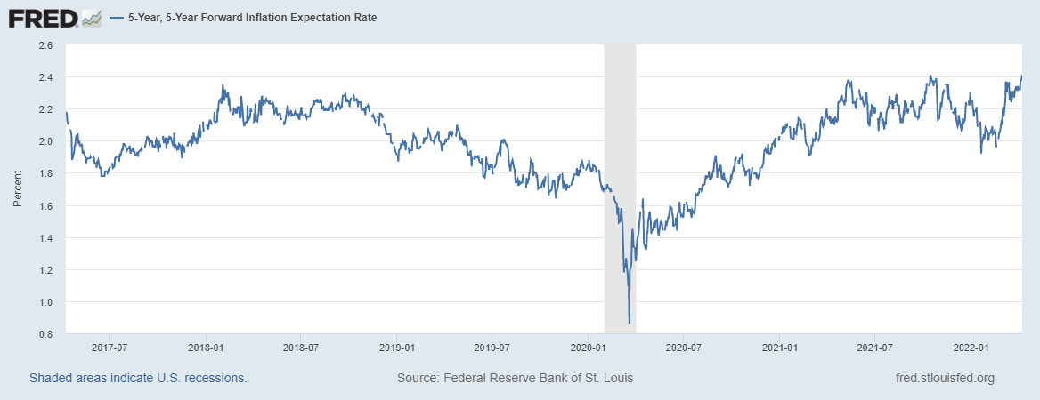
We’ve been monitoring longer term expectations, captured here in this “5 year, 5 year Forward” chart, which have seen a strong uptick recently. We will continue to monitor the situation to see where these trends go.
If we created a ton of new money (by some measures, 50% of all dollars were created in the last 2 years), but we’re not spending it like we used to, why are we seeing such high levels of inflation?
We think that the economy is still dealing with COVID related disruptions, which is why we’re seeing articles like “What’s Wrong With All the Ships?“, “What happens when Americans stay in the same house forever?” and “Is the virus still in control of the economy?”
All of this is in contrast to the economic numbers, which show more companies beating earnings estimates by wider margins than average.
Some Rare Good news (maybe)
It’s telling that this is going to be the shortest section, but here’s some good news! COVID-19 data continues to come in at the lowest levels since the start of the pandemic. At the moment here in NJ, cases are less than 25% of their peak, and the map is a nice calming shade of yellow…. for now.
So many predictions about COVID have been wrong that we’re not going to attempt to prognosticate here. We’ll continue watching this one and hope for the best.
Housing Markets
With the Fed raising interest rates, we’re seeing one of the most extreme moves in mortgage rates in recent history. We’ve been on the phone constantly with our clients who are considering changes to their housing situation, as it’s a fantastic time to sell a home but a pretty terrible time to buy, and the interesting thing is that it’s not actually the pandemic that’s to blame (although it certainly didn’t help). So we’re getting this question a lot: when will there be a good time to buy a house?
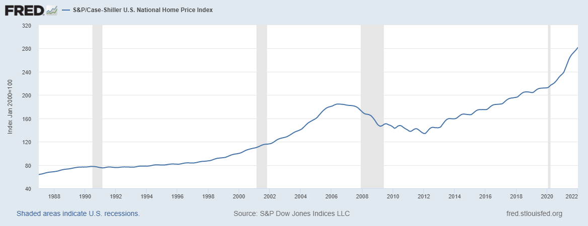
Here’s some perspective. This is a graph of the Case-Shiller home price index going back to the 60’s when they started collecting data. As you’ll see, the increase in home prices accelerated after the pandemic, but the trend was in place long before that.
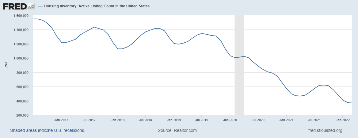
Couple this with the fact that housing inventory is at historic lows (see below), and we have a recipe for this trend to continue.
EXCEPT (and this is REALLY IMPORTANT): these historical trends have been driven by some of the cheapest mortgage rates we’ve seen ever, and this is reversing quite quickly. After the first increase in interest rates, mortgage rates went up to 4.9% on average, and new applications dropped 10% in a single week. Bottom line – we expect a bumpy ride here as well – think of it this way: a family considering paying $2,000/month in mortgage costs could have afforded a $424,000 mortgage at the beginning of March, but only $375,000 as of April. Go deeper here.
Geopolitical Impacts on the Markets
Finally, we get to the piece of the puzzle that probably brought you here in the first place. On Wednesday, 2/23/22 Russia invaded Ukraine. The markets had been dropping since the beginning of the year (we believe that the Fed’s moves are FAR more important than the Russian aggression here), but the moves in the Dow & S&P 500 were so interesting that we felt compelled to put an actual market chart here, covering the shortened trading week:
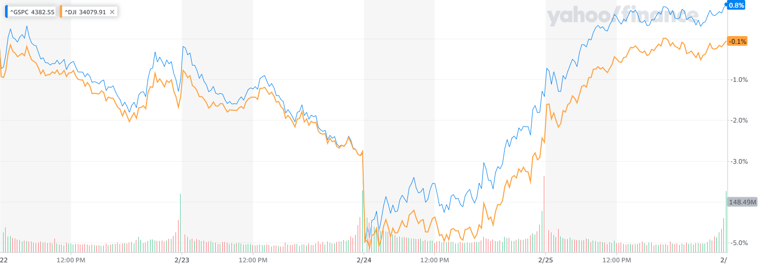
Source: Yahoo Finance
The drop in prices was sharp, but when President Biden went on TV around 1pm on the 24th, the markets reversed course quickly, and went from down 2.6% at the open to closing up 1.5%, and closed the week with strong performance. We spent most of the following weeks on the phone with clients who expressed grave concerns about the state of the world, and due to these conversations, we feel it’s important to share some analysis that should help with some of the worst of the anxieties some clients have expressed about things like the collapse of the international system of governance, the role of NATO in responding to this crisis, and the overall impact of geopolitical events on the financial markets.
In fact, that last link (here it is again in case you missed it) is so good it’s worth a deeper discussion – on page 4 of that report from State Street in August of 2018, the look at the impact of geopolitical events like the Iranian Hostage Crisis in 1979, the Iraqi invasion of Kuwait in 1990, the Arab Spring in 2011, and the US Embassy bombings in Africa in 1998 (among others), and found that with one exception, all of those events were completely recouped by the markets in under 4 months, although in a few cases there were negative returns after 1 year as you might expect.
Early in my career, I had a tendency to over-politicize the markets. Research like this helped me get past that, and understand that there is a difference between the grief we feel at the massive and unnecessary loss of life we’re seeing on the ground and the impact on the markets.
If you want to do something to help the situation on the ground, our Donor Advised Fund partners at ImpactAssets have created a Ukraine Crisis Relief Fund, supporting over a dozen nonprofits doing work on Refugee Support, including medical & health support, Crisis Response, and Democracy & Journalism. If you would like to learn more about how we use Donor Advised Funds to support our clients’ tax efficient charitable giving strategies, please get in touch.
Portfolio Analysis
Now is NOT the time to make changes
Please click the buttons below to see a report on each model from Morningstar, or click into the areas below for more information.
As there are no changes at this time, our recommendation is to HOLD through this period of volatility.
While we will not be making changes to the investment allocations, we will be using our discretion to determine a time to rebalance all accounts to bring them into alignment with the models.
All model portfolios are presented at a $100,000 value, & all performance numbers are quoted net of a 1% management fee.
Also, you may be interested in this feature that Morningstar did on Max this quarter!